A few months ago we launched a new visit planning feature on whitney.org. Varyingly referred to internally as “Today at the Whitney” or “What’s on Today”, this feature came about after a conversation with a number of our colleagues in Visitor Services around our Plan Your Visit and Events calendar pages. They brought up how difficult it can be for visitors to get a good view “at a glance” of what all is happening at the Whitney on a given day, and wondered if there was a way we could better serve this need on whitney.org. To anyone who’s visited museums and their websites, this is likely a familiar problem.
Ultimately the solution we came up with did three important things:
- Drove more people to our event pages
- Increased traffic to our ticketing platform
- Noticeably boosted our overall ecommerce conversion rate, despite including zero ecommerce focused features or calls to action.
At the same time we also discovered a new and interesting method for messaging upcoming events, and revamped a portion of our public WiFi login process. We set out to improve the visit planning experience on single page of whitney.org, and ended up supporting the broader goals of getting more visitors committed to visiting the museum, and orienting them once they’re here.
Considering the problem
The core challenge for us was, how do you show both numerous long running exhibitions AND brief special events that only happen at certain times on certain days, without overwhelming the viewer with information? A traditional calendar might work well for daily events, but with exhibitions that run for months, how do you best mix the two and still have it make sense “at a glance”? Especially when the distinction between a special exhibition and an event, meaningful in terms of museum programming, might often be unimportant to the average visitor who is simply interested in anything that’s available for them to do.
There are a number of examples of other museums that have attempted to solve this very real problem, but given our own particular blend of programming and distinctive design style, we thought we’d need to break a bit from our peers and generate our own solution.
The questions we really needed to answer were 1) what’s the minimum amount of information that a future visitor needs while still providing context, and 2) what sort of layout and functionality supports a simple path to discovery? Keeping the amount of content to a minimum was incredibly important, as the whole concept would still live in parallel with the existing fleshed-out exhibitions and events sections of whitney.org. And ultimately, those sections would likely better serve someone with a more specific idea of what they were looking for. What we were after was a starting point for someone to think about what they would do during their visit.
With that in mind, what we kept coming back to was: what would someone physically hand you if we could design and produce a museum guide for the exact day you were planning to visit, or even while at the museum? The paper guide experience is an extremely familiar one, and seemed to offer the closest equivalent to the experience we were aiming for: not a deep dive, but something to guide you as you moved (or planned to move) through the museum.
Using paper as inspiration
Right around when we started this project, I happened to visit the Philadelphia Museum of Art, where I ran across this handout:
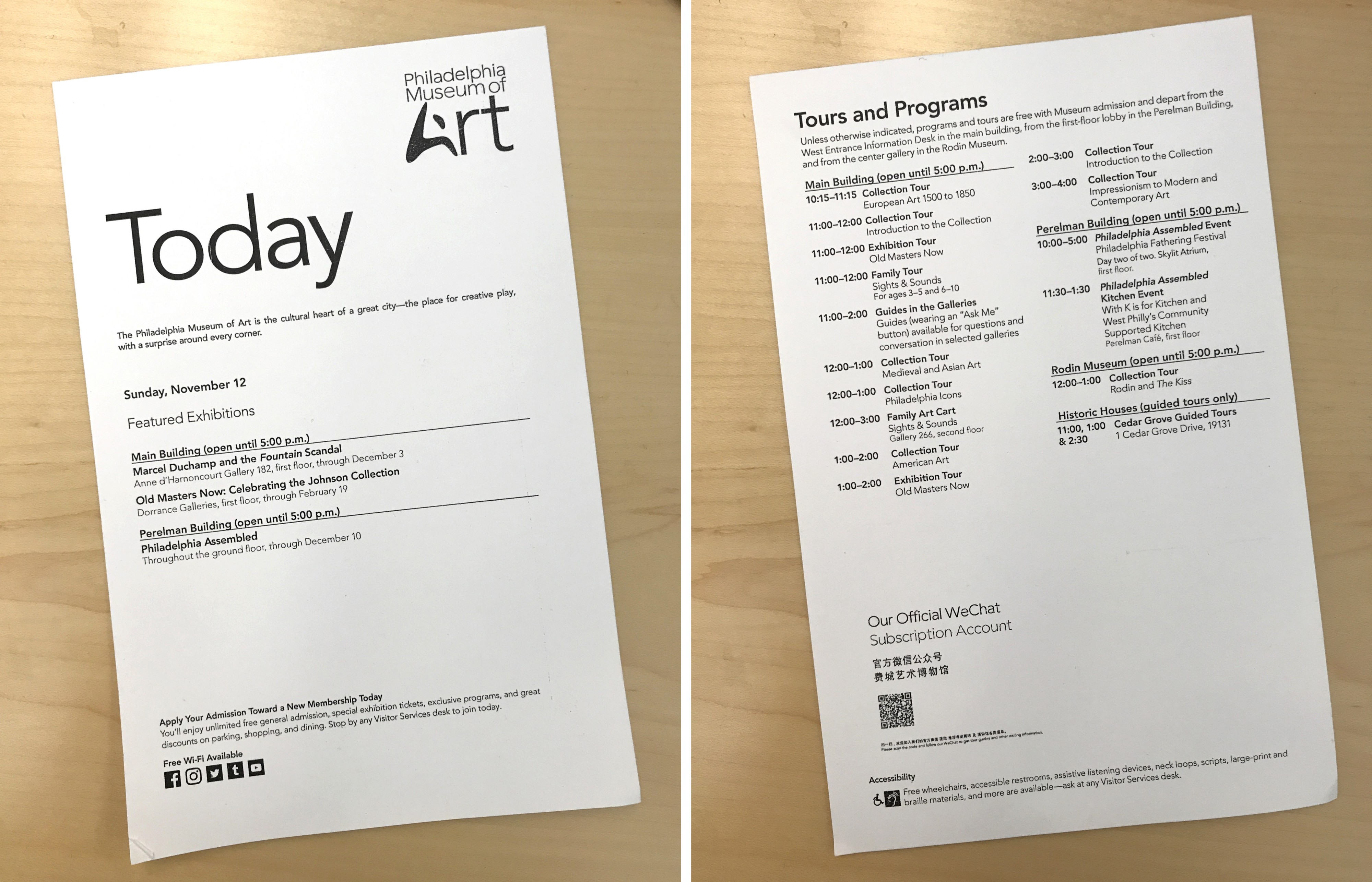
While it only covered the day’s events and a small selection of the exhibitions on view, this was by far the most helpful piece of messaging around events I can recall encountering at a museum. It’s incredibly straightforward, clearly organized chronologically, and gives someone (like me) who does not tend to seek out information about events a solid impression of options I wouldn’t otherwise have considered. Printing physical paper drags along all kinds of complications, but the idea, translated to digital, felt very close to something that could work for the Whitney.
Putting it together with exhibitions
Armed with the understanding that a chronological list (not surprisingly) is very helpful for parsing events at a glance, the remaining challenge was how to mix it with a presentation of our current exhibitions and any other potential content. Focusing on this feature as a visit planning tool, we decided to limit our display of exhibitions to those that had a physical presence at the museum. This meant stripping out our online-only content, our then-current billboard, and any other exhibitions that did not strictly have a presence on a floor within the building that a visitor could expect to see. This limited the content we would need to showcase, lessening the risk of the feature becoming overwhelming.
At the same time, through rough experimentations to more polished explorations with our colleagues in Graphic Design, we jettisoned earlier thoughts of also including hours and dining information. Exhibitions and events offered enough of an organizational challenge, and adding anything else pushed us into territory where it seemed like we would have to hide some amount of the content behind user interactions…defeating the original goal of having everything “at a glance.”
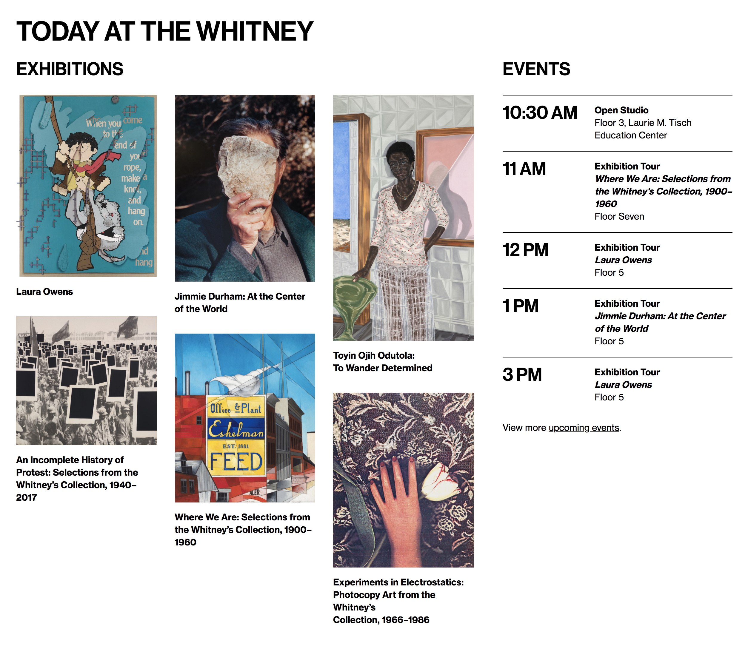
With our content scope settled, we determined how much information to include about both kinds of programming, and put it all together. What we ended up with was a sort of side-by-side presentation of exhibitions and events, with the former arranged in an image-centric masonry grid, and the latter in a vertical list that allowed for the clear display of times. This solution felt appropriate because it addressed the critical pieces of what each content type needed to get across: events happen a specific time, and exhibition images are helpful (even if not perfectly representative) in terms of grabbing someone’s attention, and giving them at least a slight sense of what a show might entail.
Benchmarking right from launch
In a first for whitney.org and our team, we did not launch a major feature for 100% of our audience: “Today at the Whitney” went out with a hard soft-launch for 90% of our web visitors, with 10% receiving the previous version of the Visit page, sans new planning tool. We did this purely so we would have a benchmark to compare against, and see what effects the new feature might have.
While this might sound reminiscent of our approach to A/B testing, it’s different in the critical fact that “Today at the Whitney” was always going to ship. This was not a comparison between two competing options: the feature was going out, and we would iterate it on it going forward. But by releasing it to just the majority of our audience rather than all of it (via Google Optimize), we allowed ourselves the chance to better understand the product we had built.
Measuring success
With “Today at the Whitney” released through Google Optimize, we had 3 metrics chosen to observe:
- Traffic to exhibition pages
- Traffic to event pages
- Traffic to our ticketing site
One of the more interesting questions raised by a feature like this, is whether success should be reflected in an increase or a decrease to the expanded views of the represented content. Is “Today at the Whitney” more successful if it sends fewer people to our exhibition pages, because they no longer need to navigate to the richer views to get a sense of what’s on, or is it less successful because they neglected to take a deeper dive? I think you can make an argument for both options, which is a huge part of why it felt so important to measure any changes to these metrics post-launch. Both reflected strategies might have their positives and negatives, but we ought to know which one we’re shifting towards.
Changing behavior through supportive content
We ran our Google Optimize experiment for 3 weeks after “Today at the Whitney” was launched for 90% of our audience, and covered approximately 25,000 user visits to our Visit page. In terms of user traffic to exhibition and event pages, “Today at the Whitney” decreased the conversion rate by ~3.5% to exhibitions, and increased it by ~17% to events. It also increased the conversion rate to our ticketing site by ~8.3%, and our overall ecommerce ($$$) conversion rate by ~3.5% over the period.
The slight drop in traffic to our exhibition pages seemed reasonable in light of our speculation about certain users only wanting a “glance” of what was on instead of a deeper dive. The huge increase in the traffic to our event pages on the other hand was a more delightful surprise, and suggests that this feature is serving a need that wasn’t previously being met elsewhere in the user journey. Perhaps most intriguing however was the bump in traffic to our ticketing site, and the subsequent purchase rate. “Today at the Whitney” has no callout to ticketing, so any change in these numbers isn’t due to some new button or link: it’s due to users simply being more interested in purchasing tickets.
Moving the needle on ecommerce while trying to provide a better visit planning experience is an ideal outcome for a feature like this. Through building a display of content to support the user experience on our site, we ultimately impacted our broader goal of trying to get more visitors into the museum.
A surprise second product and what’s next
At the same time we were working on “Today at the Whitney”, we were (at first) unrelatedly updating our public WiFi login flow. After enough time staring at both projects, and given some particularly tight technical constraints around WiFi login, there was a bit of a light bulb moment where we decided to try incorporating a simple listing of the days upcoming events into the screen a user would see immediately after connecting. And as it turned out, this felt quite natural, and in many ways turned into the sleeper success of this project.
Additionally, since the initial launch we’ve made a number of improvements to “Today at the Whitney”, including turning it into a “Tomorrow at the Whitney” feature once the museum has closed for the day. Going forward we may want to expand it again to include some concept of weekend planning, or draw on stronger links to our general events calendar. The challenge will continue to be how much can we include, while keeping the “at a glance” view understandable and readable for the average user.
The strategy of launching a major feature, even one limited to a certain section of a single page, to a portion of our audience and benchmarking the remainder, was vital to understanding “Today at the Whitney.” That strategy will not always be appropriate or viable for all of our releases, but when possible, and in conjunction with user testing, A/B testing, and Google Analytics, it’s something we’ll continue to do in the future.